SELF-BUILT PRODUCT
place by pcp
A shared, living workspace for selections, inspiration, and client decisions.
place by pcp is a collaborative interior-design platform I built for a live residential project. It replaces a workflow scattered across WhatsApp, email, Pinterest, spreadsheets, product tabs, and static presentations with one shared environment.
The product is designed around the actual social structure of a high-touch home project: a designer managing the work, primary clients making decisions, and family stakeholders who want visibility and a voice without turning every opinion into an edit.
Role
Product concept, product management, UX, visual design, and AI-assisted development
Format
Client-facing web application and Chrome extension
Status
Live client prototype
Product areas
Workflow design, collaboration, sourcing, budgeting, and curation
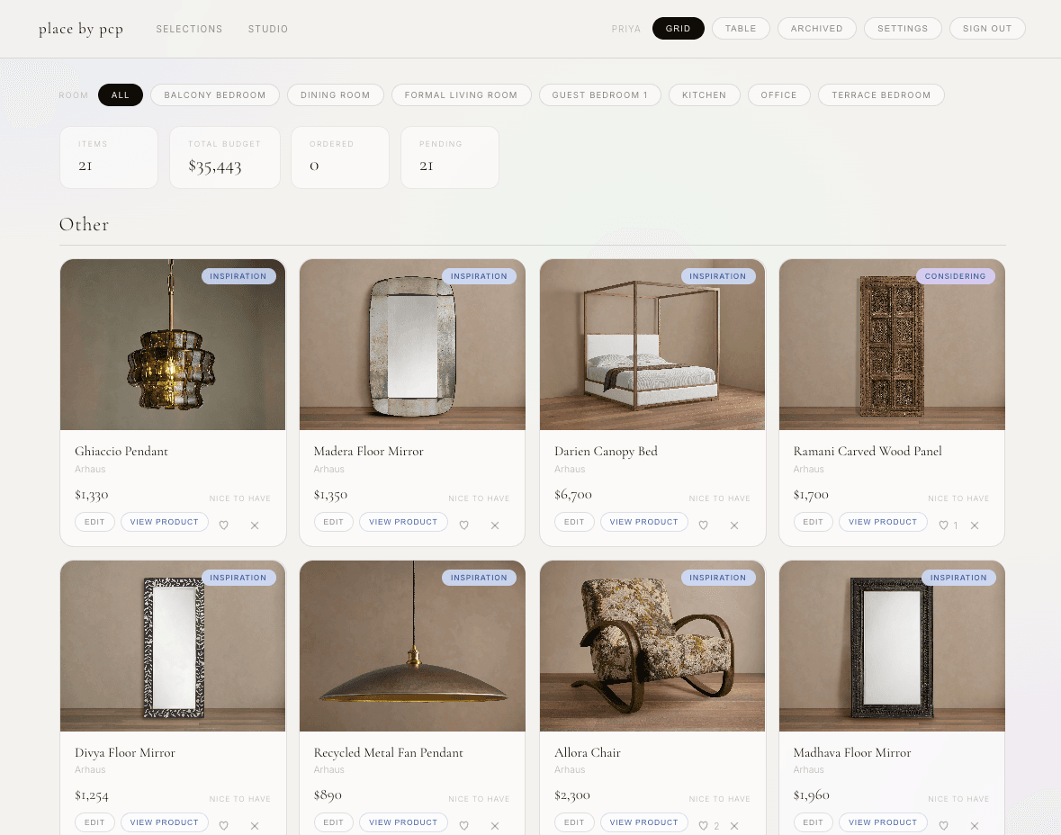
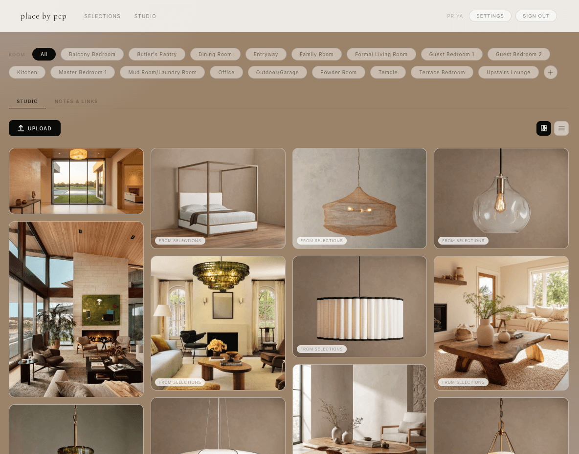
The product separates structured decision-making from visual exploration while keeping both inside the same project.
WHY I MADE IT
The middle of an interior-design project is strangely difficult to see.
A product may begin as a browser tab, move into a WhatsApp thread, appear on a Pinterest board, enter a spreadsheet, and eventually become a line in a presentation. The image, price, room, status, client reaction, and design rationale rarely remain connected.
That fragmentation creates work for the designer and uncertainty for the client. Links disappear. Decisions lose context. Budgets become stale. The client sees polished presentations but not the living process that produced them.
I built place by pcp to make that process visible, organized, and collaborative without reducing it to a project-management dashboard.
The product is not a better spreadsheet. It is a shared memory of the design process.
SEPARATE INSPIRATION FROM COMMITMENT
The central product decision was to recognize that inspiration and selection are related, but they are not the same activity.
A moodboard is emotional, associative, and unfinished. A product registry is structured, financial, and increasingly consequential. Combining them into one interface would make the moodboard feel administrative and the registry feel imprecise.
I therefore designed two connected modes.
01
SELECTIONS
The functional layer of the project. Products are organized by room, category, vendor, price, status, priority, and purchasing information. Clients can browse, compare, react, and understand how individual objects affect the broader budget.
02
STUDIO
The visual and emotional layer. Room imagery, reference interiors, existing pieces, materials, and product inspiration live in a more atmospheric masonry layout. Studio is intended to feel like a private editorial space rather than a database.
An inspiration item can move into Selections when it becomes a serious candidate. A selected product can remain visible inside Studio when it contributes to the room's visual direction. The two modes remain distinct without becoming disconnected.
KEY PRODUCT DECISION
Give emotional exploration and operational decision-making different interfaces.
CAPTURE WHERE SOURCING ALREADY HAPPENS
The primary input mechanism is a Chrome extension.
Interior sourcing already happens across vendor websites, so asking the designer to copy every product into a separate form would recreate the administrative work the product was meant to remove.
The extension reads product information from the page, pre-populates the available fields, and allows the designer to review the result before saving it directly into the project registry.
- Product name
- Price
- Vendor
- Product image
- Dimensions
- Material
- Color
- Product URL
The designer then assigns the item to a room, category, status, and priority.
Product extraction uses a combination of structured page data and fallback heuristics, including JSON-LD, Shopify data, Next.js page data, and DOM inspection.
Before saving, duplicate detection checks for an exact URL match and high title similarity. The designer can review the warning and still choose to add the item when the apparent duplicate is intentional.
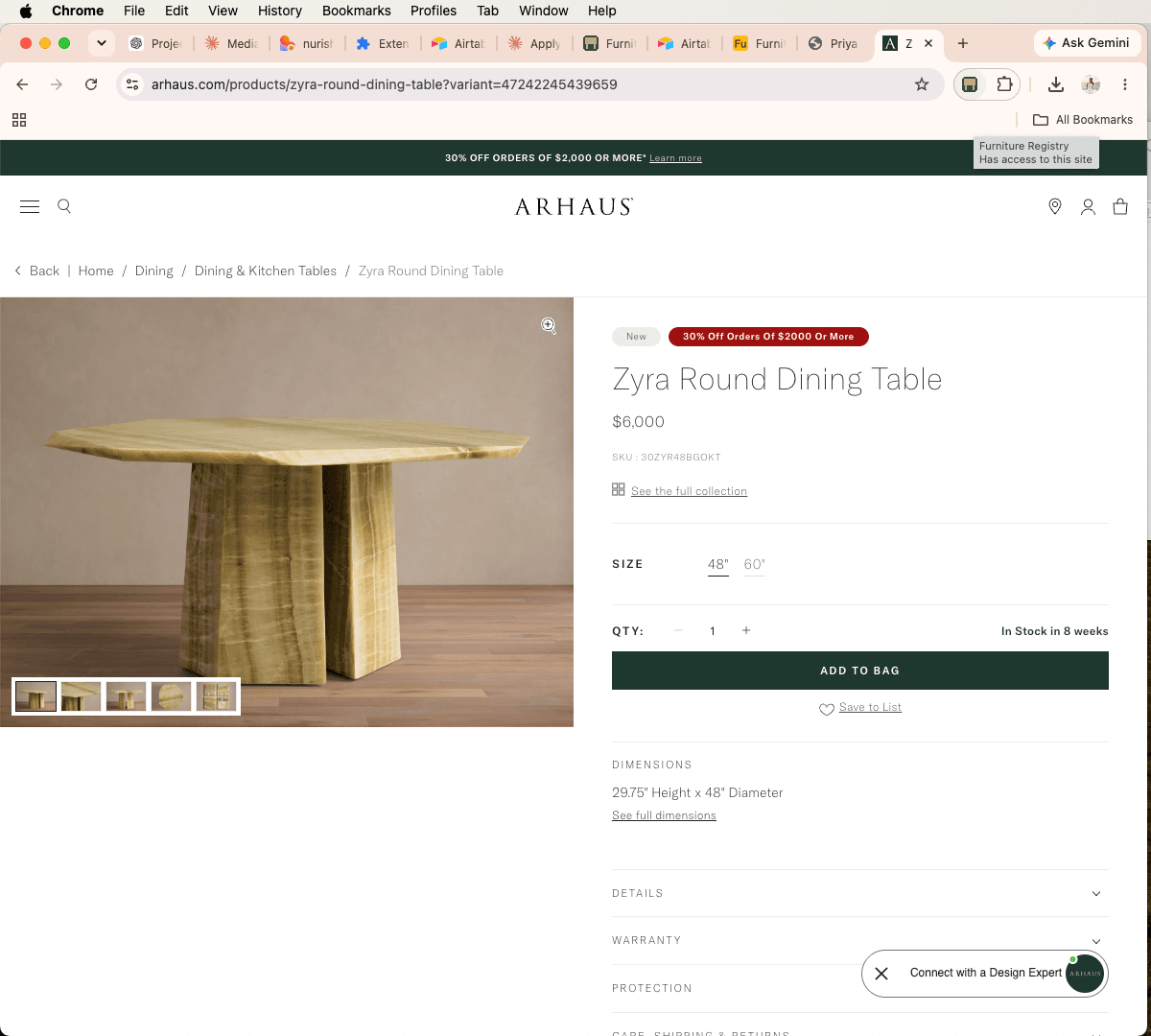
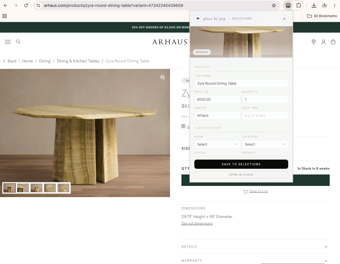
The extension turns a product page into a structured selection without forcing the designer to leave the sourcing workflow.
01
BROWSE
The designer sources products on existing vendor websites.
02
EXTRACT
The extension identifies the available product information.
03
REVIEW
The designer corrects or completes the metadata.
04
CLASSIFY
The item receives a room, category, status, and priority.
05
SAVE
The product is written directly into the shared registry.
THE LIVING REGISTRY
Selections is the operational center of the platform.
Every product remains connected to the information needed to understand and act on it: where it belongs, what it costs, who sells it, whether it is only inspiration or under serious consideration, whether it has been ordered, and how the client has responded.
Users can move between a visual grid and a compact table without changing the underlying data.
The grid supports visual comparison and browsing. The table supports budgeting, review, and export.
ROOM FILTERING
The same room list is used across the extension, Selections, and Studio. Rooms are stored centrally rather than hardcoded into each interface.
DYNAMIC BUDGET TOTALS
The displayed budget updates according to the currently visible room or selection set.
STATUS AND PRIORITY
Items can move through states such as Inspiration, Considering, Shortlisted, and Ordered while retaining a separate level of purchasing priority.
CLIENT REACTIONS
Clients and family stakeholders can express a lightweight preference without replacing the designer's structured decision process.
ARCHIVE AND RECOVERY
Items can be removed from the active project without being permanently destroyed, then restored when required.
EXPORT
The table view can be downloaded as CSV or Excel for purchasing, review, or external coordination.
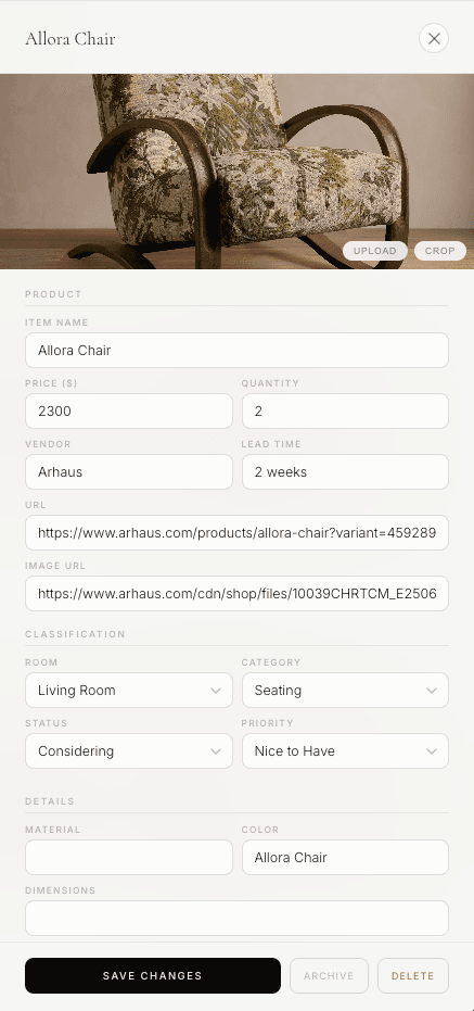
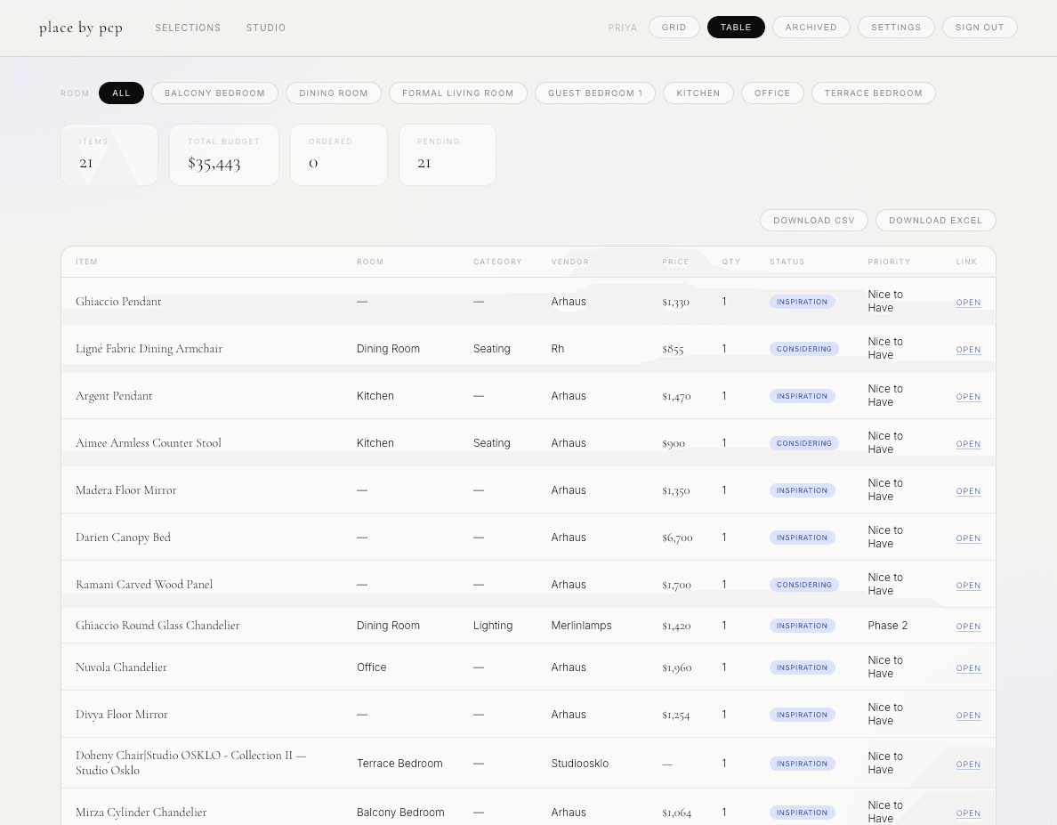
The same selection can be experienced visually, edited in detail, or reviewed as structured project data.
PARTICIPATION WITHOUT CHAOS
A residential project can involve more people than the person formally hiring the designer.
Partners, parents, siblings, and other family members may have meaningful opinions, but giving every participant full editing authority would weaken the curated workflow and make accountability unclear.
I designed the access model around different levels of participation.
ADMIN
The designer can view and edit selections, manage rooms, archive or delete records, configure the project, and see budget information.
CLIENT
The primary client can view the complete project, participate in decisions, and access the budget and collaborative tools.
GUEST
Family stakeholders can browse, react, post notes, and share inspiration without changing structured product records or viewing information that should remain restricted.
The goal was not to remove family participation. It was to give that participation a form that did not allow the design process to become directionless.
KEY PRODUCT DECISION
Visibility should be broad. Editing authority should not be.
KEEPING CONVERSATION IN CONTEXT
Design communication does not consist only of formal approvals.
Clients send Instagram posts, Pinterest links, videos, products, observations, and half-formed ideas. These fragments are often useful, but they become difficult to interpret once they are separated from the room or decision that prompted them.
The Notes & Links layer keeps that informal communication inside the project.
Users can share a URL, add a note, associate it with a room, react, and reply directly to a message. The feature is intentionally lightweight. It is not meant to replace every form of communication; it is meant to keep design-specific communication attached to the design work.
STUDIO AS AN EXPERIENCE
Studio is deliberately less dense than Selections.
At rest, the interface gives priority to the images. Product and reference metadata appears only when it becomes useful, keeping the room's atmosphere from being overwhelmed by labels and controls.
Inspiration can be uploaded directly or added through a URL. Items already marked as inspiration in Selections can also surface inside Studio, while promising Studio items can move into the purchasing workflow.
The background adapts to the imagery within the selected room, allowing each space to develop its own visual tone.
The purpose of Studio is not to make the product prettier. It is to preserve the emotional form of the design process alongside the financial and operational form.
BUILD CHOICES
I chose the product architecture for the scale and reality of the project rather than treating the prototype as a miniature enterprise platform.
FRONTEND
HTML, CSS, and vanilla JavaScript
Chosen for speed, direct control, and a small codebase without a framework dependency.
DATA
Airtable
Used as the shared source of truth for selections, rooms, inspiration, notes, reactions, and project history. Airtable also gives a non-technical designer direct visibility into the underlying records.
UPLOADS
Cloudinary
Used for room imagery, moodboards, and other uploaded visual assets.
CAPTURE
Chrome Extension, Manifest V3
Used to bring product data into the platform from vendor websites.
DEPLOYMENT
GitHub and Vercel
Changes move through a staging branch and preview environment before reaching the client-facing build.
The architecture is intentionally practical. It allowed me to build, test, and operate a real client workflow without creating infrastructure that the current product did not need.
A CLIENT PROTOTYPE, NOT YET A PLATFORM
place by pcp was built for one trusted residential project, and some of its current choices reflect that scale.
The present build uses lightweight persistent access appropriate to a small known user group. A multi-client commercial product would require stronger authentication, project-level data isolation, more formal permission enforcement, and a client-distribution system for the extension.
That boundary is intentional and visible. The prototype was designed to prove the workflow before investing in platform infrastructure.
CURRENT PRODUCT BOUNDARY
A functioning single-client system with a path toward multi-client architecture.
THE MOST IMPORTANT PRODUCT DECISIONS
01
CAPTURE PRODUCTS FROM THE BROWSER
The input mechanism lives where sourcing already happens, reducing repetitive entry and lost product context.
02
SEPARATE SELECTIONS FROM STUDIO
Operational decisions and visual exploration remain connected without forcing one interface to perform two incompatible jobs.
03
CENTRALIZE ROOMS
The room list acts as shared infrastructure across the extension, registry, Studio, notes, and future modules.
04
DESIGN PARTICIPATION BY ROLE
Clients and family members can remain involved without receiving the same authority over structured project records.
WHAT I WOULD TEST NEXT
The current product proves that the workflow can live in one place. The next questions concern how well that structure supports decisions over the life of a project.
01
Does saving through the extension materially reduce the time required to maintain an accurate product registry?
02
Do clients understand the difference between inspiration, consideration, and commitment without additional explanation?
03
Which reactions and comments actually help the designer make a decision, and which create more noise?
04
Does separating Studio from Selections make the project easier to understand, or does it make users uncertain about where an item belongs?
05
What changes when the system supports several clients and projects rather than one trusted residential engagement?
These are proposed validation questions, not claims about completed formal user research or measured product performance.
WHAT I LEARNED
Building place by pcp taught me that product architecture mattered more than adding features. The value came from connecting capture, room organization, collaboration, budget, and procurement into one coherent path, not creating another place to save beautiful objects. AI helped me move faster as an engineering collaborator, but the product strategy still depended on deciding what the system should make easier.